
Why We Built Atlas
A few years ago, doing real analysis on a public dataset meant living in Colab, Jupyter, or Kaggle: downloading a CSV, learning enough Python and SQL to wrangle it, and bringing a fair amount of domain knowledge just to ask the right question. Today you can plug a dataset into an AI and get most of the way there, which is genuinely great. But it is still hard to go deep and to be confident that the analysis is actually correct. And even once you are happy with what you found, sharing it usually means exporting screenshots, writing up the story somewhere else, and hoping the analysis survives the trip. What if you could do all of it in one app, so the focus was on exploring the data rather than on setting up the environment to explore it?
That is exactly what Atlas is. It started as a CU final-year engineering project hosted by Credible. The idea was to build on their engine and find out what became possible. With Credible handling the data foundation, the interesting question became what you could build on top of it. We picked a deliberately broad answer: a public data explorer with 40+ datasets, where you analyze through natural language, shape the visualization however you want, and publish your findings to a feed other people can pick up and build on.
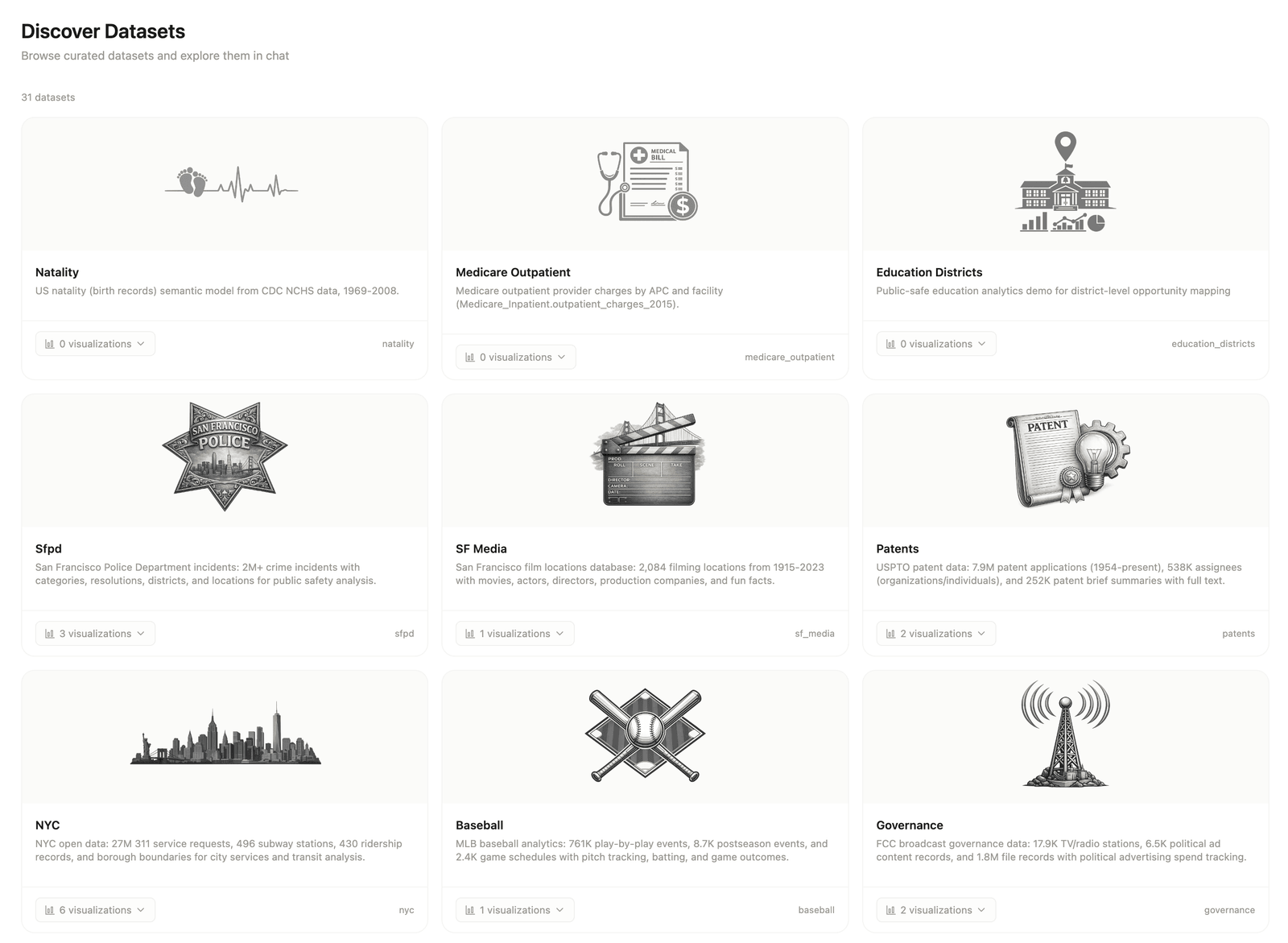
Image 1: The Discover page surfaces the full dataset catalog. Each card links to an AI-enriched overview with exploration ideas and starter questions.
Two things usually make a project like this hard: building an AI agent that behaves, and giving it data it can actually trust. We didn’t have to build either foundation from scratch. The Claude Agent SDK gave us the agent framework, and Credible generated the governed semantic layer that results in trusted queries. That freed us to spend our real effort on the parts users actually touch: getting to the right chart, designing the interface around it, and building everything that happens after you find something worth sharing.
This post is about those parts, and a few places we changed our minds along the way.
The NBA Dataset
For this post, we will demonstrate Atlas using the NBA dataset, which is registered as a Credible package containing a single Malloy model (nba.malloy) with three sources:
| Source | Grain | What it contains |
|---|---|---|
games | One row per game | Scores, teams, venues, attendance, officials, game type |
players | One row per player | Demographics, draft info, physical attributes, career years |
player_statistics | One row per player per game | Points, assists, rebounds, minutes, plus-minus, shooting splits |
The underlying data is the public NBA Dataset: Box Scores and Stats (1947-Today) on Kaggle; its game, player, and player-box-score files map to the three sources above.
We wrote Malloy models for this data and published them to Credible, which makes the data ready for an AI agent to query over MCP. A package is simply the unit we publish: a folder with a manifest ({name, version, description}) and one or more .malloy model files. A source is the central noun in Malloy: a table or query plus the measures and relationships defined on top of it, the reusable, semantic unit the agent actually queries against.
Each source includes dimensions, measures, and descriptions defined in the Malloy model and published through Credible. When an AI agent queries this dataset, it doesn't see raw database tables. It sees a governed data model.
How a Question Becomes a Chart
When a user opens Atlas, navigates to the NBA dataset, and types a question such as "Which players averaged the most points per game?", a chart is built in three phases, followed by the part most users actually spend their time in: refinement.
- Source discovery
- Field resolution
- Query execution
Let's walk through each phase, then we will explore refinement.
Phase 1: Source discovery
Atlas routes the question to an AI agent, which has access to Credible through the Model Context Protocol (MCP), a standard way for AI applications to discover and use external tools and data sources.
Over MCP, Credible hands the agent two tools, and the whole flow is built on them:
get_contextis how the agent learns what the data is. Rather than dumping a raw schema, it answers questions like "what sources are there about the NBA?" or "which measures relate to points?" and returns plain-language descriptions and relevance scores for each match. Think of it as the agent reading the data dictionary before it writes anything.execute_queryis how the agent runs a query. Once it knows the right source and fields, it hands Credible a Malloy query and gets structured rows back.
The pattern is "understand, then ask." The agent uses get_context to figure out what exists and what it means, and only then uses execute_query to actually run something. The first thing it does is call get_context to find relevant sources.
{
  "method": "tools/call",
  "params": {
    "name": "get_context",
    "arguments": {
      "search_targets": [
        { "target_type": "source", "search_text": "nba" }
      ]
    }
  }
}
Credible returns matching sources together with semantic descriptions. Here is a condensed version of the response for player_statistics:
{
  "source_info": {
    "resource_id": {
      "environment": "Atlas",
      "package": "nba",
      "model_path": "nba.malloy",
      "source": "player_statistics"
    },
    "summary": "The player_statistics source represents individual player performance metrics for specific basketball games, where each row corresponds to a single player's stat line in a single game. It is primarily used to analyze player performance trends, calculate season-long averages, and evaluate game-level outcomes."
  },
  "relevance": 0.9
}
This is not a table schema. It is a semantic description of what the source means and what it is for. The agent reads this and selects player_statistics as the right source for a question about points per game. It doesn't guess from column names; the model tells it which source is appropriate.
Phase 2: Field resolution
Now the agent knows which source to use, but it still needs to identify the correct measure. It calls get_context again, this time searching for entities related to "points" within the player_statistics source.
{
  "method": "tools/call",
  "params": {
    "name": "get_context",
    "arguments": {
      "search_targets": [
        { "target_type": "measure", "search_text": "points" }
      ],
      "scopes": [{
        "environment": "Atlas",
        "package": "nba",
        "model_path": "nba.malloy",
        "source": "player_statistics"
      }]
    }
  }
}
Credible returns the matching entities:
[
  { "entity": "total_points",    "type": "measure", "description": "Total points scored",                       "relevance": 0.95 },
  { "entity": "points_per_game", "type": "measure", "description": "Average points scored per game",            "relevance": 0.94 },
  { "entity": "avg_plus_minus",  "type": "measure", "description": "Average plus minus points for games played", "relevance": 0.77 }
]
The agent selects points_per_game because its description matches the user's intent. It also discovers that full_name is available as a dimension for grouping players. Again, this decision is based on the data model rather than a guess about column names.
Phase 3: Query execution
With the source, measure, and dimension resolved, the agent constructs a Malloy query and calls execute_query.
{
  "name": "execute_query",
  "arguments": {
    "environment": "Atlas",
    "package": "nba",
    "model_path": "nba.malloy",
    "query": "run: player_statistics -> {
                group_by: full_name
                aggregate: points_per_game
                order_by: points_per_game desc
                limit: 15
              }",
    "chart_type": "bar",
    "x_field": "full_name",
    "y_field": "points_per_game",
    "suggested_title": "Top 15 Players by Points Per Game"
  }
}
This is where Malloy becomes important. The query reads much like the original question: group players by name, calculate points per game, sort descending, and return the top 15 results. Credible compiles the query against the data model and executes it. The results come back as structured rows:
full_name               | points_per_game
------------------------|----------------
Luka Doncic             | 33.9
Giannis Antetokounmpo   | 30.4
Shai Gilgeous-Alexander | 30.1
...
Atlas renders this as an interactive bar chart directly in the chat, streamed to the browser over Server-Sent Events as the query completes.
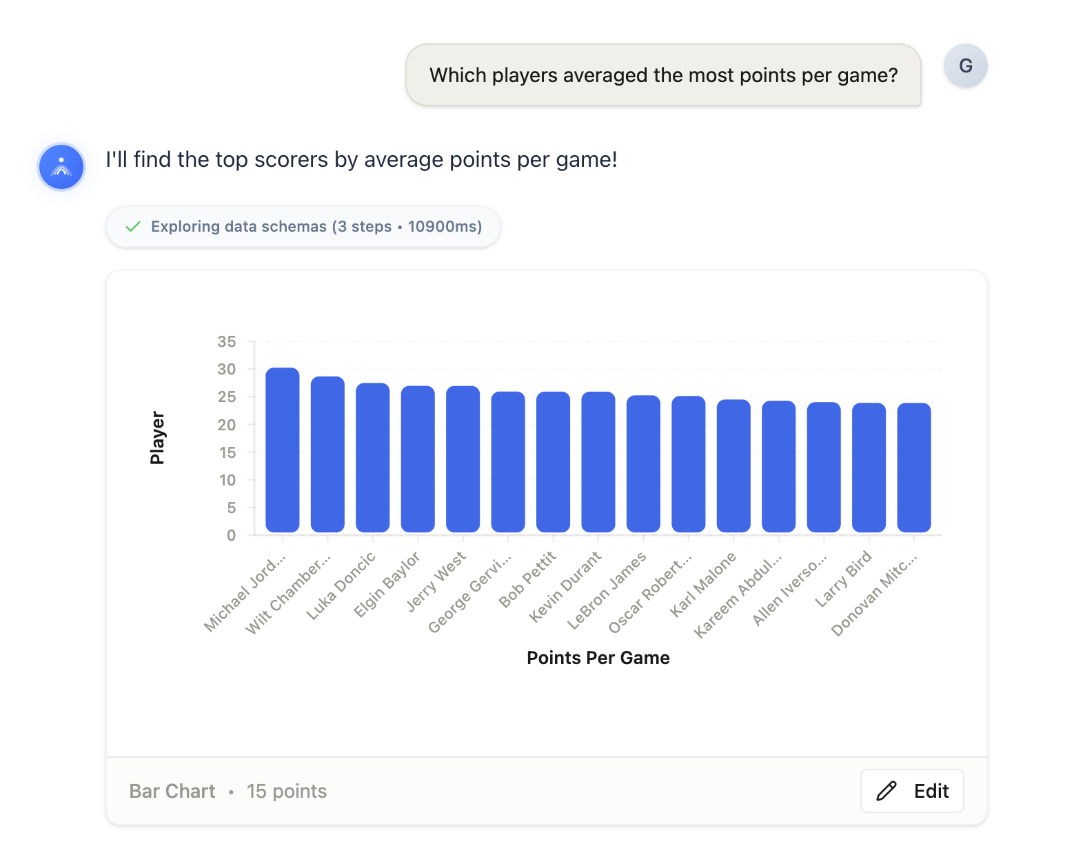
Image 2: The user asks "Which players averaged the most points per game?" and Atlas returns an interactive chart with AI-written analysis, all grounded in the governed Malloy model.
After the chart: refinement
The first chart is rarely the final one. Once it exists, you start shaping it: changing the colors, switching to a different chart type, relabeling an axis, or tweaking the question itself. That back-and-forth is what we mean by refinement, and it is where most people actually spend their time.
You can refine from the controls sidebar or just ask in plain language. For example, the user sees the result and says:
Make it horizontal with the sunset palette.
The agent calls update_chart_style:
{
  "name": "update_chart_style",
  "arguments": {
    "swap_axes": true,
    "palette": "sunset"
  }
}
This tool does not call Credible at all. It is a pure UI operation: the chart re-renders with swapped axes and new colors, but the underlying data and query are unchanged. That separation matters for responsiveness. Style changes are instant because they never touch the database.
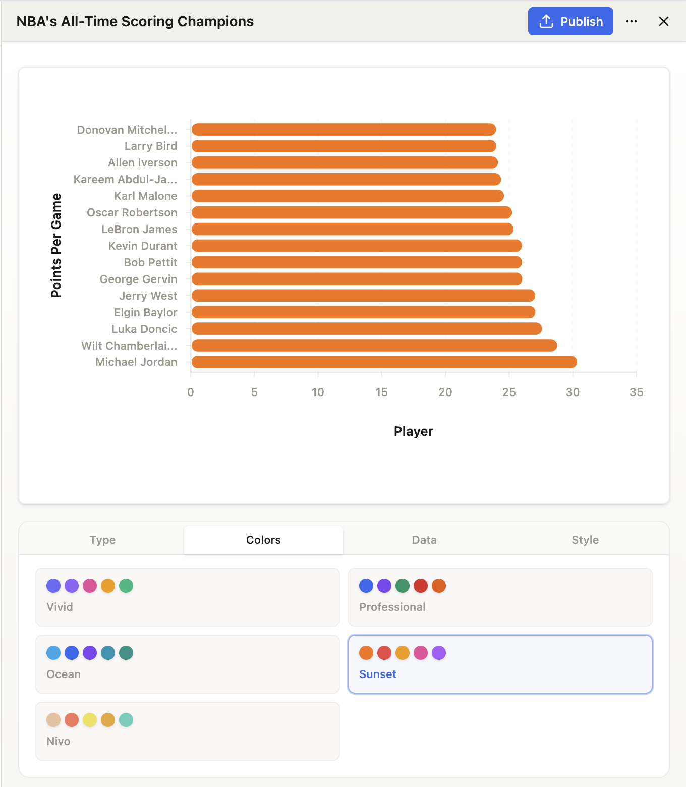
Image 3: The controls sidebar lets users switch chart types, pick color palettes, remap data fields, and adjust styling, all without writing code. Changes apply live to the chart.
What Makes Atlas Reliable
The whole trick is that the agent never improvises against a raw schema. Every query is compiled against Credible's published Malloy model before it runs, so a field the agent didn't actually look up simply fails to compile. When it does get something wrong, the error comes back as a compile error rather than a confident but wrong number, and the agent repairs it by calling get_context again instead of guessing harder. Reliability here isn't a clever prompt, it is the model being the source of truth.
That same foundation is why we could move quickly. We never had to build a query engine, a semantic layer, or a governance story, because Credible generates them from the Malloy model. Malloy gives us governed measures like points_per_game that always compute the same thing, and Credible publishes and serves those definitions over MCP. With the data layer solved, we put our real effort into the parts a user actually sees: the charts, the editor, and the feed.
The Charts Were the Surprising Part
If one part of Atlas took more engineering than we expected, it was the charts. We render everything with Nivo, which gives us a lot of polish for free, but every chart type wants its data in a different shape. The same flat rows that come back from a Malloy query have to become a 2-D matrix for a heatmap, a hierarchy for a treemap, a date-and-value series for a calendar, and a pivoted table for a grouped bar chart. We ended up writing a separate adapter for each of the twelve chart types: one raw shape in, twelve very different shapes out.
The fiddly parts were the ones you only notice when they are wrong. Thirty bars on a phone screen and the x-axis labels collide, so Atlas samples the ticks evenly across the range, rotates them, and computes the margin from the projected height of the longest label rather than guessing. Bars auto-flip to horizontal past about twenty-five categories. Label colors are chosen by luminance so text stays legible on any palette. And a few of Nivo's defaults needed working around; its waffle-chart legend renders in a clipped layer, for instance, so we capture the legend data and draw our own beneath the chart.
That same control over the rendering layer is what lets the agent annotate a chart on request. Ask it to "flag the 2016 spike" and it matches your phrase against the points Nivo has actually laid out on screen, then pins a callout there, a small touch that only works because the chart is ours to reach into.
Beyond Charts: Publishing and Stories
Getting a chart from a question is useful, but data work doesn't end there. It ends with communicating what you found. This is the part of Atlas we are most excited about, and the reason we built more than a chat box.
Publishing visualizations
Any chart from a chat can be published to the community feed in one click. Atlas snapshots the data and chart configuration, and it goes live as an interactive visualization that anyone can view, like, comment on, and explore. This is the painful last mile of data work made trivial: no export step, no copy-paste into a doc.
Once visualizations were working, we ran into a subtler problem: a chart can be hard to understand at a glance, and a reader scrolling the feed needs to know what they are looking at right away. So when you publish, Atlas generates a fitting title along with a short callout that sits under the visualization and tells you what the chart shows in a sentence. If you want more, an Insights button expands into a fuller description.
Published charts are snapshots, capturing the data as it was at publish time, but each one also carries the Malloy query and Credible package that produced it. Another user can click "Explore in Chat" to load it into a new conversation, change the query, and publish their own version, so every chart becomes a starting point for someone else. Related charts from a single session can also be published together as a carousel.
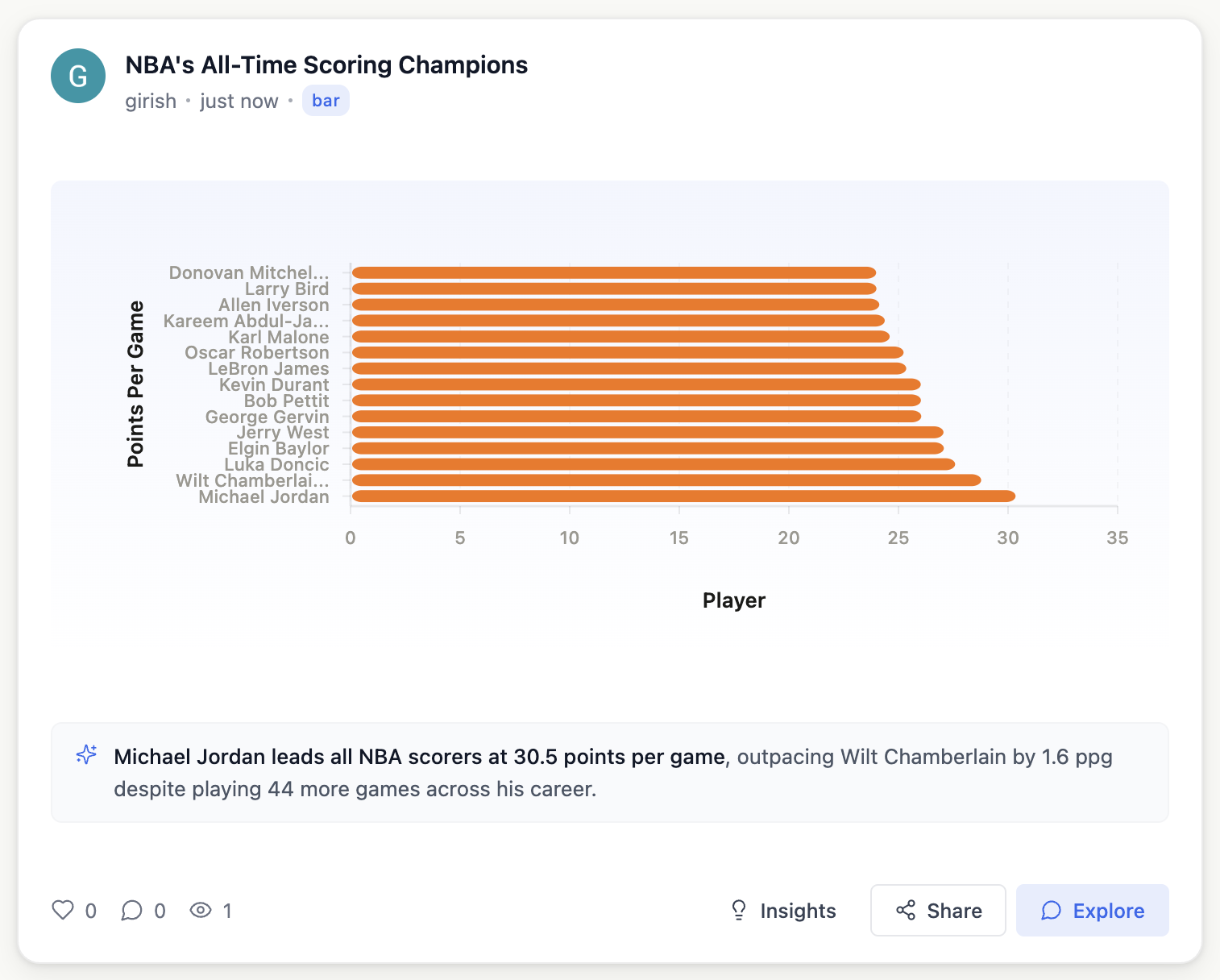
Image 4: Published visualizations on the community feed with live chart previews, engagement controls, and an "Explore" button that loads the chart into a new chat session.
Telling the larger narrative
A single chart answers one question, but real exploration rarely stops at one. By the time you have dug into a dataset, you are not holding a single visualization, you are holding a whole conversation full of them, and there is usually a larger narrative connecting them. That is what Stories are for.
We love a good Medium post about data, the kind that walks you through a question with charts and commentary until something clicks. But writing one is a slog: before you write a single sentence you need the data, you need to wrangle it into compelling charts, and only then do you get to the part you actually cared about, the narrative. Atlas already does the first two for you. By the time you have had a good chat, the data and a pile of interesting charts are sitting right there in the conversation. So instead of making you start over in a separate tool, Stories turn that conversation into a finished, fully editable piece, removing almost all of the friction between "I found something interesting" and "here is a post other people can read."
How Stories work
After a chat where you have explored the NBA data from several angles, you hit "Create Story" and Atlas drafts the whole narrative for you. It pulls the charts from your conversation, reads the data behind them, and writes a structured first draft: a title, an introduction, a section of explanatory prose for each chart, callout quotes for the key insights, and a conclusion.
The result lands in an editor where each element is a standalone block that can be moved around or removed:
| Block type | Purpose |
|---|---|
| Section | Chapter headings |
| Paragraph | Prose with basic formatting |
| Chart | Live embedded visualization from the chat |
| Callout | Highlighted insight quotes |
The charts aren't screenshots. They render like all other charts on the app, including all styling and data. You can rearrange sections, edit the narrative, and even add new blocks. The editor autosaves continuously, and when you are ready, you publish.
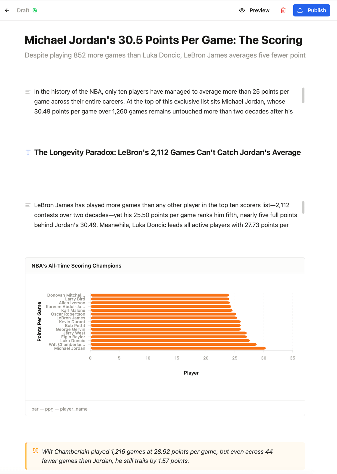
Image 5: The block editor with an AI-drafted story. Prose, charts, and callout blocks are all editable. The chart renders live from the data, not a screenshot.
Toggle to preview mode and the story renders as a polished reading experience: clean typography, live charts, and highlighted insights, with a reading progress bar and chapter navigation.
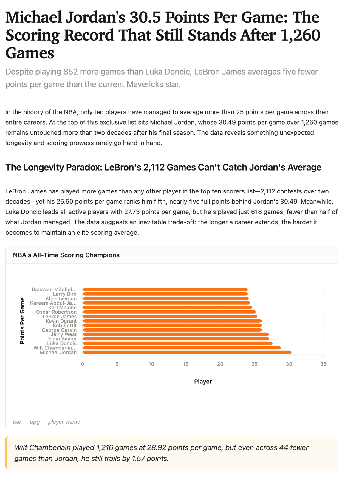
Image 6: Preview mode shows the story as readers will see it.
The entire loop from question to chart to published narrative can happen in a single session. No export step, no switching tools, no copy-pasting charts into a Google Doc.
And like everything else on the platform, once published to Atlas, you can share these stories with anyone on the internet.
The Community Layer
Atlas is designed as a shared space to create and share visualizations and stories. It includes:
- Home feed. A unified stream of published visualizations and stories, ranked by engagement. Sort by hot, trending, or recent, or filter to people you follow or content you have liked. Visualization cards render live chart previews directly in the feed; story cards show thumbnail charts and read-time estimates.
- Discover. Dataset-first browsing for when the question is "what data exists?" The full catalog is searchable and filterable: NBA, NYC Taxi, World Bank economic indicators, Chicago crime, aviation, and many more. Each dataset card links to an AI-enriched info modal with a description, exploration ideas, and starter questions. Click any of them and you are in a chat session with that dataset loaded as context.
- Engagement. Likes, threaded comments, follows, and view tracking. Published stories support the same engagement patterns as visualizations, and both appear in the same feed.
- Remix. Every published chart has an "Explore in Chat" button that loads the visualization's query, data, and styling into a new conversation. You can modify, extend, and republish. There is no formal fork or lineage tracking; the reuse model is organic, through conversation.
What We Learned, and Where Atlas Goes Next
Building Atlas taught us a few things that outlast the project itself.
The first is just how much the quality of the answers depends on the quality of the context. Once the agent could see what the data actually means, with plain-language descriptions, governed measures, and relationships instead of a bare list of columns, it stopped needing to be coaxed. Most of our work on making Atlas trustworthy went into the data model and the discovery flow, not into wording the prompt.
The second is that the small architectural choices are the ones users feel. Splitting data changes from style changes made the whole thing feel fast, because visual tweaks are instant while only real data changes pay for a new query. And because every chart carries the exact Malloy query behind it, anyone can see how a number was computed. Transparency you can read is what turns "the AI made a chart" into "I can see why I should trust it."
The third only became clear once people started using Atlas: chat is just the beginning. Conversation gets you from a question to an insight, but publishing, stories, and remixing are what make that insight useful to anyone else. That is the difference between a chat box and a platform.
This was also our first time building on a semantic layer, and the biggest surprise was how much more there is to do with one. Atlas turned out to be just one application of it, and we keep running into ideas we want to try next. Atlas itself has grown into something mature that we will keep investing in, and we are always on the lookout for fun public datasets to add, so if there is one you would love to explore, reach out.
Mostly, we are curious where Atlas can go from here. Maybe it lets you bring your own data. Maybe it grows into the place that does everything a community could want around data exploration: visualizations, stories, infographics, slide decks, who knows.
We are excited to find out!
Try It Yourself
Atlas is live and open to explore. Browse datasets, ask questions, publish charts, and create stories.
- Try Atlas: start with the NBA dataset and over 40 others
- Watch the Demo: a guided walkthrough of the full experience
- Credible Data: learn about the AI Analytics Engine Atlas is built on
- Malloy on GitHub: the open-source query language powering every dataset